

I chose this design because it is simple and has no meaning.


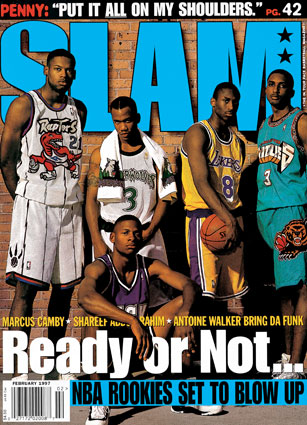
I chose this cover because this is the greatest draft class of all time. A suggestion I have is having Shareff wearing the other Grizzlies jersey so he doesn't blend with the words. A strength this has is I really like how it looks like Ray Allen's arm is resting on the words.
I chose this cover because of the awesome picture it has. I think the design is so cool I cannot find a suggestion for this. A strength of this cover is how neatly organized the cover it is. This cover is very ascetically pleasing.

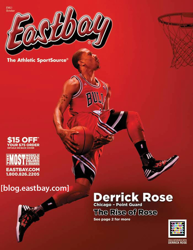
I chose this because Derrick Rose was my favorite player before he got injured. A suggestion I have for this is a change in color for the rim. Is blends in to the background and becomes hard to see. A strength of this is the way the text style matches the jersey he is wearing.
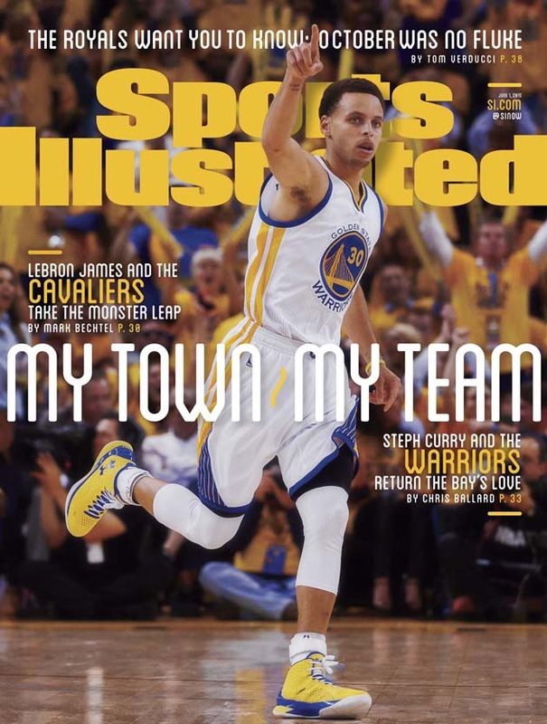
I chose this because Stephen Curry is the best shooter in NBA history. A suggestion is adding some text or something by his feet because it looks empty. A strength of this cover is the consistency of the colors.
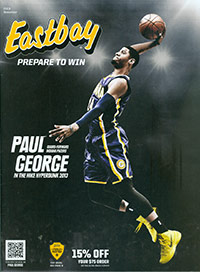
I chose this one because Paul George is a huge inspiration coming back from a terrible injury. A suggestion I have is maybe having a more interesting background. A strength is the fact the the words are not cut off but the picture in any way. Everything fits together perfectly.
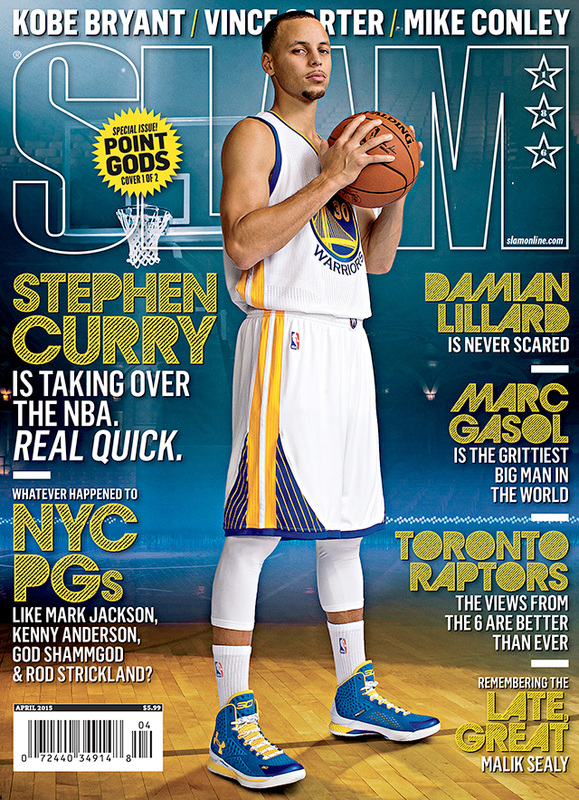
I chose this because Stephen Curry is my favorite player in the NBA. 1 suggestion I have is that his head cuts off Vince Carter. A strength of this is the color scheme is very simple but catches your eye.
3 things I learned are there are specific ways to organize magazines, magazine designs change over time, and photographer and model credit will sometimes be used for the title.
2 interesting facts are that copyrighting magazine designs is a big deal and barcodes include publication date and price.
1 question I have is why is it so important to properly organize a magazine cover.
2 interesting facts are that copyrighting magazine designs is a big deal and barcodes include publication date and price.
1 question I have is why is it so important to properly organize a magazine cover.


Before |
After |


BeforeReplace Color
Selective Color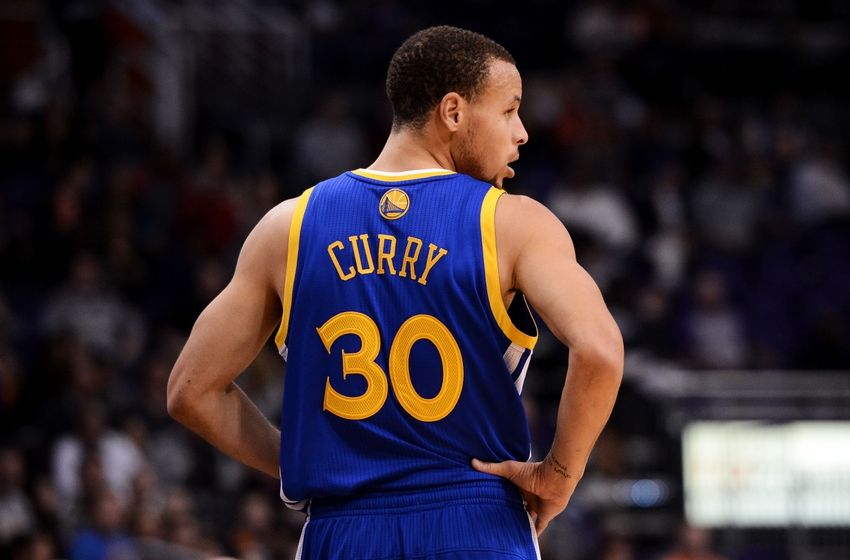
Color Replacement Tool
|
AfterReplace Color
Selective Color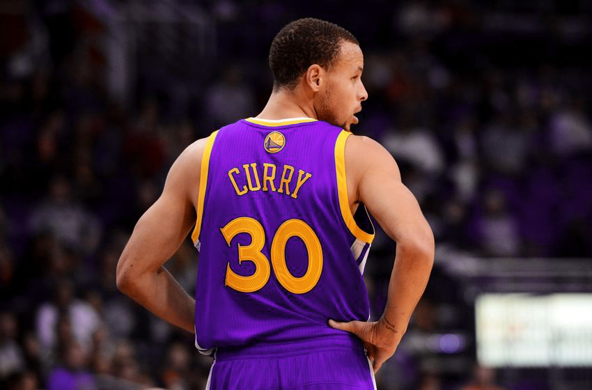
Color Replacement Tool
|


I would give myself a grade of 3 out of 4. The digital image looks a lot sloppier than it does in person. On the computer it looks very messy and very rushed but in person it looks detailed. I prefer how it looks in person.
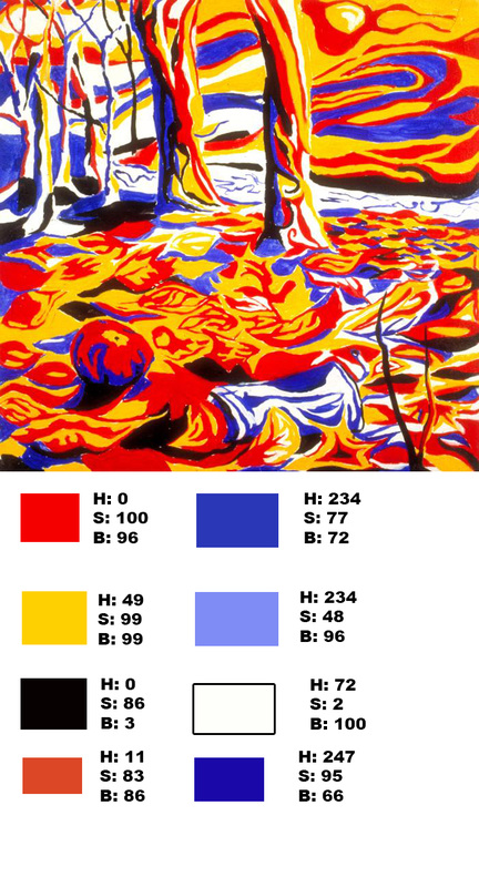
I would define the color values as different shades of the colors. The numbers are analogous. The artist used these colors to show variety in the painting.
- Primary colors can make secondary colors
- Sir Isaac Newton developed the first circular diagram of colors.
- Analogous colors are any three colors which are side by side on a 12 part color wheel, such as yellow-green, yellow, and yellow-orange.
- In 1666 the first circular diagram was invented. This is interesting because it was a long time ago.
- There are three types of colors. Primary, Secondary, and Tertiary. This is interesting because it shows the differences in colors
- Why was it important to differentiate the colors?


|

|

|

|